Histogram Example
(Quantitative Data)
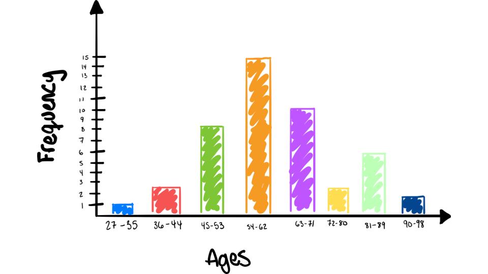
For this example lets look at the 50 wealthiest people in the world data from Forbes Magazine again
| Classes | Frequencies |
| 27-35 | 1 |
| 36-44 | 3 |
| 45-53 | 9 |
| 54-62 | 15 |
| 63-71 | 10 |
| 72-80 | 3 |
| 81-89 | 7 |
| 90-98 | 2 |
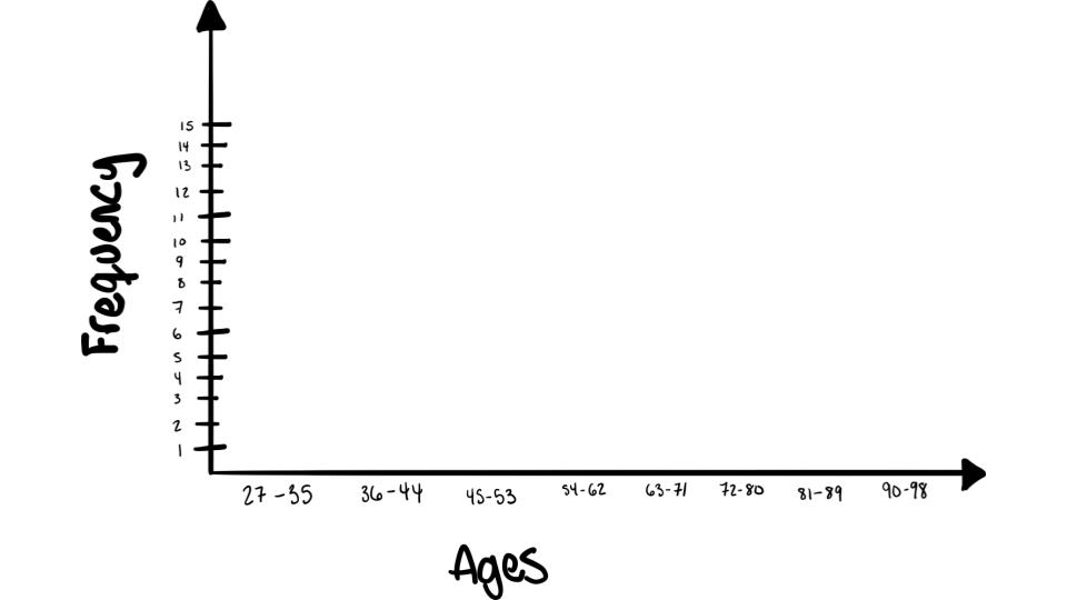
Step 1: Label the \(x\) and \(y\) axis

Step 2: Label your classes

Step 3: Graph the frequencies!

To see this done view the following video: